After reading Gary's thoughts on Helvetica and his discussion into the sounds that typeface may make; futura being German and Helvetica sounding swiss. This inspired me to think how letterforms and typefaces can sound like cultures in this case countries or contain the personality of the designer that created them. How the words they spell can possibly connote the country, language or spirit that the typeface originates from.
Looking at my own work on relation to this and specifically the age behind the letterforms I've chosen this piece which was for a 'type as image' brief where I designed this poster that typographically illustrated the quote 'we get older'. I wanted to convey the age of the author that wrote each separate word, I didn't do this by utilizing pre-existing typefaces but creating and using hand-written letterforms that visualised age. The first word 'we' is scribbled in a rounded fashion, much like how a infant first learning to write would. The second word 'are' is intended to communicate an adults handwriting; clean, legible and functional. It is probably the least successful in terms of communicating age of the author as there is no cliche style of an adult's handwriting, the age and variety of style is too vast to pin point a synonymous appearance. However the final word 'Older' connotes frailty and visualises a fragile author, it is in fact my grandmother's hand writing.
The piece of graphic design I have chosen to analyse is this poster appealing to people to help Japan which has recently been devastated by an 8.8 earthquake. This particular poster is a good example of a redundant design, it's message will be understood the world over to those in contact with the main channels of media; newspaper, television or the internet. The design incorporates the Red circle which is affiliated globally as the symbol for Japan, possibly because it is also part of their national flag. The lines also communicate the marks made from a richter scale whilst also working as the white background for the Red circle to sit where the image as a whole becomes the Japanese flag.
When the Shannon-Weaver mathematical model is applied the Information source would be the richter scales and Japan, the Transmitter (encoder) would be the design and the colours, the Channel would be the poster, the receiver would be the audience's eyes/mind and the destination would be the individual looking at the poster. The redundancy of the design is how the red circle and the richter scale line work together to form the Japanese flag, communicating the earthquake that happened in Japan. The white and the red are synonymous with Japan and Japanese culture.
Entropically the design loses a great amount of information if the audience does not know Japanese culture or current affairs, and at first glance the lines may be confusing. When the concept of noise is applied, the poster can be considered to look like sky scrapers instead of a format of measuring earthquakes. The only other possible noise that could affect the poster and message is the environment that the poster is present in, which in this case was gallery which contained several other posters appealing to people to help the same cause, this could saturate the message somewhat and weaken the impact of the message.
As a piece of design though I think that the poster communicates redundantly and is successful in completing the Shannon-Weaver model
Sustainability is a communal concept which many individuals use as a means to tackle the problem of climate change and the environmental crisis in general. It is the ability to meet our present day needs without negatively impacting the ability of future generations to meet their needs. In reality, the responsibility of living sustainably has fallen to the individual and it tends to ostracize poorer members of the community due to a lack of affordable environmental technologies. Capitalism is the empowering element in the economy that seems to interfere and disrupt the path of sustainability for the purpose of profit. Capitalism is always seeking gain and profit in a commodity, which in this case is sustainability. Capitalism is a method of making the most of a resource and squeezing every last drop of profit out of it whilst not replenishing that resource. The economy as it is now does not regenerate resources and as a result the world’s natural resources are dwindling and never before have we been without enough resources to supply the Earth’s population. Capitalization has the tendency to enter a potential or existing profitable market and eventually dominate that economic environment by means of accumulation. A ‘crises of capitalism’ is when capitalization has reached its confines and has to develop new measures of profit, which results in the formation of a new market. A prime example of such an innovation is the environmental crisis and the ‘green’ market where capitalization introduced an influx of products that were disguised and marketed as ecological but in truth were equally as harmful as the original or equivalent product. This is known as ‘greenwashing’ and follows the mindset of capitalism, which upholds the idea that we can buy our way out of a disaster. An example of this is BIOX bio-diesel and the production plant that was built in Canada. The plant was built in a residential area on ‘green’ land and produced bio diesel that was more environmentally friendly that normal fuel but at a higher cost, plus the production of the diesel introduced pollution to the surrounding area. Some people could say that this would encourage people to continue spending in the current market or invest more money into a new market; both result in a capitalist gain. This is just one solution to the question of sustainability and it is a capitalist solution. The ecologists propose that instead of altering certain aspects of the capitalist structure it should be eliminated entirely to be left with a completely new system designed for the preservation and progression of environmentalism and its philosophies. This new design would re-use and regenerate resources to supply our natural basic needs but this is unrealistic in todays market where capitalism seeks to accumulate and take profit from resources and not meet the needs of the consumer but instead stimulates the greed of the industry and the people who profit from it.
To What Extent Is Typography Used To Brand Musical Subcultures and Counter Cultures
By Danny Holland
The identity of a subculture does not solely rely on the images that advertise it or the fashion that its followers purposely wear, nor is it just the demographic that chose to be a part of it or the colours that are used to convey it. All of these elements that characterise a movement or a subculture work along side a typeface or a typographical style.
A subculture is a view, idea or choice that is against the actions and choices of the masses or the establishment that speaks and acts for them. It is an action that precedes that choice and is what separates a group of people from the cultural hegemony. These choices derive from social issues and problems that produce them and the choice of actions that are used to solve them. Deliberation in context of these problems to arrive at a solution causes breakaway factions of thought and view; these are the roots and beginnings of a subculture.
Here I want to introduce hegemony, a word that derives from Hégemonîa, Greek for leadership. It is a theory and term coined by the Marxist inspired intellectual, Antonio Gramsci. Gramsci is referred to as one of the leading contributors to popular cultural theory and was unlike most Marxist theorists because he wasn’t a part of the intellectual society and environment of a university or career. He was instead a prisoner under fascist rule, incarcerated for being one of the founders of the Italian communist party. It was there where he wrote most of his work and it was under these conditions that inspired and influenced his theories but “Marxism in this sense is above all a theory which guides, motivates and inspires, while monitoring and building, the socialist working class revolution” (Strinati 1995 p 162).
According to Strinati, hegemony should be best thought of as a “contested and shifting set of ideas by means of which dominant groups strive to secure the consent of subordinate groups to their leadership” (1995 p170). Gramsci also bases his theory on the fundamental function of an individual or a faction of people and their natural reaction to social issues and problems and the actions they take to create and inspire solutions to these problems. In this sense Gramsci nominates the struggles of the working classes and revolutionary thinking and discourse that is produced from a resistance against the hegemony as the core to any sustainable social subculture. However for the resistance to gain ground and be successful in influencing or overpowering the hegemony the faction opposing should have in place intellectuals. These subcultures or counter-hegemonies require, like hegemonies and popular culture, “work carried out by intellectuals “ (1995, p171) but in this context Gramsci doesn’t mean intellectuals such as educated writers, renowned artists or scholars but instead those who are responsible for the production and distribution of the factions ideas and concepts; “all men are intellectuals… but not all men have in society the function of intellectuals” (Gramsci 1971 cited in Strinati 1995 p 171).
Intellectuals in subcultures can then be seen as those who posses the power and skills to create and interpret the ideas of the subculture. For example in the British Punk Subculture of the late 1970’s designers and typographers such as Jamie Reid are the intellectuals of that group and have the responsibility of producing and communicating visually the key ideas of the Punk Movement. The counter culture was born out of the struggle of the working class acting against the decisions and choices of the Thatcher Government and its conservative view on society. The previous generation had turned into hypocrites, going against their original beliefs in traditional values. Among the many reasons that the Thatcher Government sparked so much protest were high unemployment and the lack of opportunity for the working class youth.Thatcher had sold the idea that the working classes could aspire to own their own house and even a car. Traditionally the working classes were content with what they had but the older generation grew to the idea that they could have more and capitalism took hold. Neighbors and communities now grew apart with the friction of money and a certain air of distrust and greed swept through the working class. The youth of the working class struggled with the changing tides of politics and society and began to rise up against the state, voicing their opposition and resistance to the hegemony. A counter-culture was born.
It is quite noticeable that possibly all subcultures and movements adopt or create a typeface to use as its own, more specifically musical subcultures. Each musical revolution has been a brand, be it for expression, revolution, anger or joy. The mood of a nation, its current affairs, its people spark inspiration, innovation and energy into the musically gifted. They then create new sounds, which carry all these meanings that the public or a specific demographic connect with. This new movement needs to be identifiable, it needs an image, it needs its own typeface. Gramsci states that the “revolutionary forces”, in this case the Punk culture, “have to take civil society before they can take the state, therefore have to build a coalition of oppositional groups united under a hegemonic banner which usurps the dominant or prevailing hegemony” (1995, p169) When applied to the visual presence of the punk movement, the banner of that subculture could be seen as the typography that was used, such as the cutout letterforms or Dymo labels. These worked to communicate the ideas and discourse of the punk movement and its counter-hegemonic and anti-establishment culture, a banner that would meet Gramsci’s proposed theory.
Since the progression of language, writing has been our secondary source of communication after speech, but it is much quicker and more efficient to reach people and spread a message through written communication than spoken word.
This has been proven through propaganda and advertising, but it also has been proven through its use in counter cultures. Especially the movement that inspired the term counter culture, the psychedelic following of the 1960’s and just as relevant in the era of the forgotten youth that was the punk era of the late 1970’s and early 1980’s.
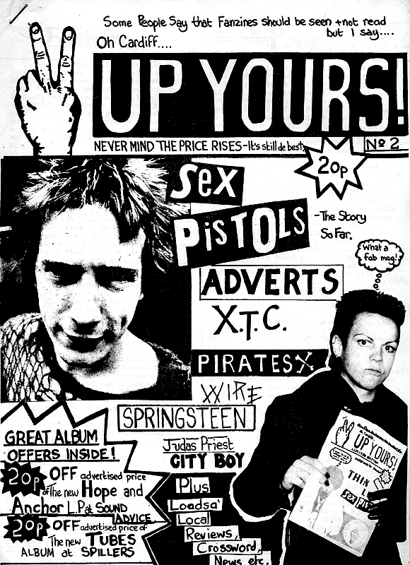
The punk revolution can be said to be the most heavily self-branded subculture, “It remains within the subculture of punk music where the homemade, A4, stapled and photocopied fanzines of the late 1970s fostered the ‘do-it-yourself’ (DIY) production techniques of cut-n-paste letterforms, photocopied and collaged images, hand-scrawled and typewritten texts, to create a recognizable graphic design aesthetic.” (Triggs, 2006). It is these handcrafted and cutout letterforms that help to identify the punk movement. This specific example also connotes the ideas and principles behind the culture of punk, the writer Stephen Duncombe explains that the fans behind the fanzines “privilege the ethic of DIY, do-it-yourself: make your own culture and stop consuming that which is made for you” (Duncombe, 1997 p 2). This was the Punk culture rising up against the ‘establishment’.
The first of these British fanzines, preferred to be known as punk zines or anything else other than fanzines due to the term ‘fan’ being too closely linked to the followers of pop music, was Snffin’ Glue. Inspired by seeing the Ramones at the Roundhouse in Camden, Mark Perry produced a DIY zine from his bedroom at home using only a children’s typewriter and a marker pen and named it Sniffin’ Glue which was taken from the Ramones song ‘Now I wanna sniff some glue’ With twenty copies that his girlfriend had photocopied at work he went to his local newsagent hoping to sell them; knowing there was a good chance they would laugh him out of the shop. Instead they bought them all and gave him an advance payment to print more. This was the beginning for Sniffin Glue and was soon to be followed by hundreds of punk zines, their success was in the urgency of the news and gossip it was reporting and in the form it was being printed in, misspellings, crossed out words and swearing to strengthen a point, now anybody could be a journalist or critic; it fitted with the punk ethos perfectly. There was no layout just collages of found media and hand scribbled headlines, it was the essence of Punk in printed form, even the zine itself encourage others to do the same with Sniffin’ Glue carrying the motto “Don’t be satisfied with what we write. Go out and write your own fanzine”(bl.uk)
The cutout letters had connotations of individuality, freedom and revolution, everything the Punk movement stood for. All of these philosophies and beliefs stemmed from the social issues of the 1970’s, where the collective feeling was of abandonment, like “falling into the cracks of society” (Turcotte and Miller, 1999 p36). The Watergate scandal and the bankruptcy of the social security system in the USA along with the Thatcher Government that seemed to unforgivingly target the working class provoked a united rebellion across the Atlantic. On both sides of the ‘pond’, activists and the forgotten youth remodeled type with little or no money; the outcome of these posters and letterforms was disheveled and chaotic, exactly how the ‘Punks’ wanted it to be. Hand drawn marker pen beside a photograph, cut and pasted letterforms from a found newspaper and the photocopy grain denoted anarchy and an intentional carelessness to rules or standards of appearance. It was an exposition of expression and subjective emotion; each flyer was a chance to prompt an insult at the political body or exhibit the visualization of anger and oppression. Scrawled handwriting and the careless composition of letters conveyed the personality of a punk. Lars Frederickson described the attraction of punk as “an emotional outlet, one where you can leave your sweat out on the microphone, or your teeth on the dance floor” (1997 p43).Posters and flyers were an egress for youth to express, and type was their strongest visual tool.
Over time subcultures and counter cultures have naturally established relationships with unique styles of type, employing a typeface to visualise emotions, deliberations and actions ensuring the communication between like-minded people and groups. Type was occasionally used to attract people’s attention to a view or opinion without it being thrust upon them by a figure of authority but instead giving that individual a choice to read that message visualised on a poster. Other times it expressed love and joy, where the curvaceous letterforms denoted freedom and a relaxed attitude. Type was given another purpose, to brand and visualise a subculture but was also given a personality. It wasn’t just either a serif or a san serif anymore, it could be alarming, colourful, playful or anarchic. Typefaces were no longer just formal letterforms, and didn’t constantly need to communicate the words they spelt because sometimes the letterforms themselves were a message such as the cut and paste type that punks used.
Subcultures transformed the way that we use, design and apply type and how we use it to communicate. Traditionally an effective typeface becomes invisible so that only the message is seen, but these counter cultures combined the message with the letterform to create a more successful medium, a representation of a culture’s values. It is here that Gramsci’s theory can be applied to the visual aesthetic of a culture and not just the discourse and ideas it tries to spread. This is really when a typeface is successful, when letterforms can communicate a topic, an image or a statement without saying anything at all, where type can posses the agenda of a culture and become a recognisable image to both the members of that culture and the members within the hegemony and the subordinate groups that follow it. Typography is a powerful tool and when used by the designers in context to connote the ideas of a counter culture they become the visual voice that the members of the culture wear as a banner.
Gastaut, A. and Criqui, J. (2005) Off the wall: psychedelic rock posters from San Francisco, London, Thames & Hudson.
Turcotte. B. And Miller, C. (1999) Fucked up + photocopied, Los Angeles, Gingko press.
Easby, A. and Oliver, H. (2007) The art of the Band T-shirt, London, Simon and Schuster.
Crimlis, R. and Turner, A. (2006) Cult Rock Posters 1972 – 1982, London, Aurum Press Limited.
Strinati, D. (1995) An introduction to theories of popular culture, London, Routledge.
Hebdige, D. (1979) Subculture the meaning of style, Oxen, Routledge
Gelder, K. (2005) The subcultures Reader, Oxen, Routledge
(2000), A history of punk in 12½ chapters, [online] Available: http://www.independent.co.uk/arts-entertainment/music/features/a-history-of-punk-in-12sup12sup-chapters-718283.html [25 MARCH]
Rabinowitz, T (2006) Exploring Typography, New York, Thompson Delmar Learning
Duncombe, S (1997) Notes from underground: zines and the politics of alternative culture, London, Versa
Capitalist // Global system of production & exchange/ more and more money - Desire
Stanford encyclopedia of philosophy/ Globalisation -
Pursuit global free market
growing dominance of western culture
utopian illusion
George Ritzer - Mcdonaldisation/
Philosophy of Mcd's Simplicity, convenience, quickness
Marshal Mcluhen - understanding media
Global village
- Visual responsible identity
- Became diversified
Media visuals - all owned by america
All content owned by american capitalism
Propaganda
- Market importance 1. US
2. Western Europe
last developing nation
US Media power = new form of capitalism
Schiller - Imperialism
> Impose culture on others for identical thinking
> Spreads philosophy of consumerism
right/wrong
Chomsky/Herman (1998)
Manufacturing consent
influencing rest of the world to think like there clients of america
Chamsley
> Propaganda model - news and media
FIVE filters (basic)
>Ownership
>Funding
>Sourcing
> Flak
>Anti-Ideologist
Rupert Murdochh - UK Media
‘The sun decides against general elections’
1/3 circulation of news conservative supporters then labour (labour won election) then conservative supporters (labour lost election)
Sourcing > media is run as a business / key stories where allowed to go
Advertising to fund
Flak - Groups that pressure media groups
> Portray different images of self
The identity of a subculture does not solely rely on the images that advertise it or the fashion that it’s followers purposely wear, nor is it just the demographic that choose to be a part of it or the colours that are used to convey it. All of these elements that characterise a movement or a subculture work along side a typeface or even several different typefaces. It is quite noticeable that possibly all subcultures and movements adopt or create a typeface to use as it’s own, more specifically musical subcultures. Each musical revolution has been a brand, be it for expression, revolution, anger or joy. The mood of a nation, it’s current affairs, it’s people sparks inspiration, innovation and energy into the musically gifted who then create new sounds which carry all these meanings that the public or a specific demographic connect with. This new movement then needs to be identifiable, it needs an image, it needs it’s own typeface. The punk revolution can be said to be the most heavily self-branded subculture, “It remains within the subculture of punk music where the homemade, A4, stapled and photocopied fanzines of the late 1970s fostered the ‘do-it-yourself’ (DIY) production techniques of cut-n-paste letterforms, photocopied and collaged images, hand-scrawled and typewritten texts, to create a recognizable graphic design aesthetic.” (scissors and glue, 2006). It is these hand-crafted and cut-out letterforms which helps identify the punk movement. This specific example also connotes the ideas and principles behind the culture of punk, the writer Stephen Duncombe explains that the fans behind the fanzines “privilege the ethic of DIY, do-it-yourself: make your own culture and stop consuming that which is made for you” (Notes From the Underground, 1997).
Typography and the power it holds within [pop] culture
/Investigating the effect of typography on pop culture and how pop culture through recent decades has adopted typography and certain typefaces and permanently linked the two.
/ The effect of typography on different trends such as punk and hip hop and how the two are associated with specific typefaces.
/ How different aspects of life are guided by typography, brands, music and politics
/ The philosophies of the subculture that type connotes
/ How subcultures and counter cultures brand themselves using not just imagery but also type
>Gastaut, A. and Criqui, J. (2005) Off the wall: psychedelic rock posters from San Francisco, London, Thames & Hudson.
>Turcotte. B. and Miller, C. (1999) Fucked up + photocopied, Los Angeles, Gingko press.
>Easby, A. and Oliver, H. (2007) The art of the Band T-shirt, London, Simon and Schuster.
>Crimlis, R. and Turner, A. (2006) Cult Rock Posters 1972 – 1982, London, Aurum Press Limited.
or
The 'gaze' and the 'modern man'
I want to base my essay on a point that was raised in the seminar on the gaze, and how are men now becoming more 'watched'. I want to look at the rise in mens fashion and the design that is being produced alongside it and also the effect on advertising.
/ I want to explore how in recent times males have become more image conscious, and how that effects or can be compared to the female gaze, "men watch women, whilst women watch themselves".
/ Have men, maybe specifically metrosexual men (men comfortable with 'taking care of themselves' and looking trendy) now become part of the gaze, is this what women want men to look like or behave.
/Is it still a male controlled environment or have women began to have more power in the media, many editors of magazines are now female.
/ Is they a certain kind a male that fits the active female gaze, or is they're argument for an active male gaze?